

Announcing Billy: An Accessibility Design Toolkit
One of the coolest internal projects I've ever been able to work on.

THE TLDR RECAP
Innovation doesn't mean sacrificing standards – Billy proves you can make accessibility tools both functional and delightful
Design challenges often have unexpected solutions – like using a goat as a mascot to make complex guidelines more approachable
Community-driven development leads to better outcomes – our team grew from two to 12+, each bringing unique perspectives
Breaking industry conventions can differentiate your product while still serving user needs
Personal projects, given time and collaboration, can evolve into powerful tools for positive change
To bastardize Paul Harvey
And now, for the actual story.
We all have personal projects we work on, abuse, ignore, crawl back to, and finish. Regardless of which of those stages your current project resides, I can relate.
Personal projects have long been a way for me to scratch itches that I can’t get at with typical 9-5 work.
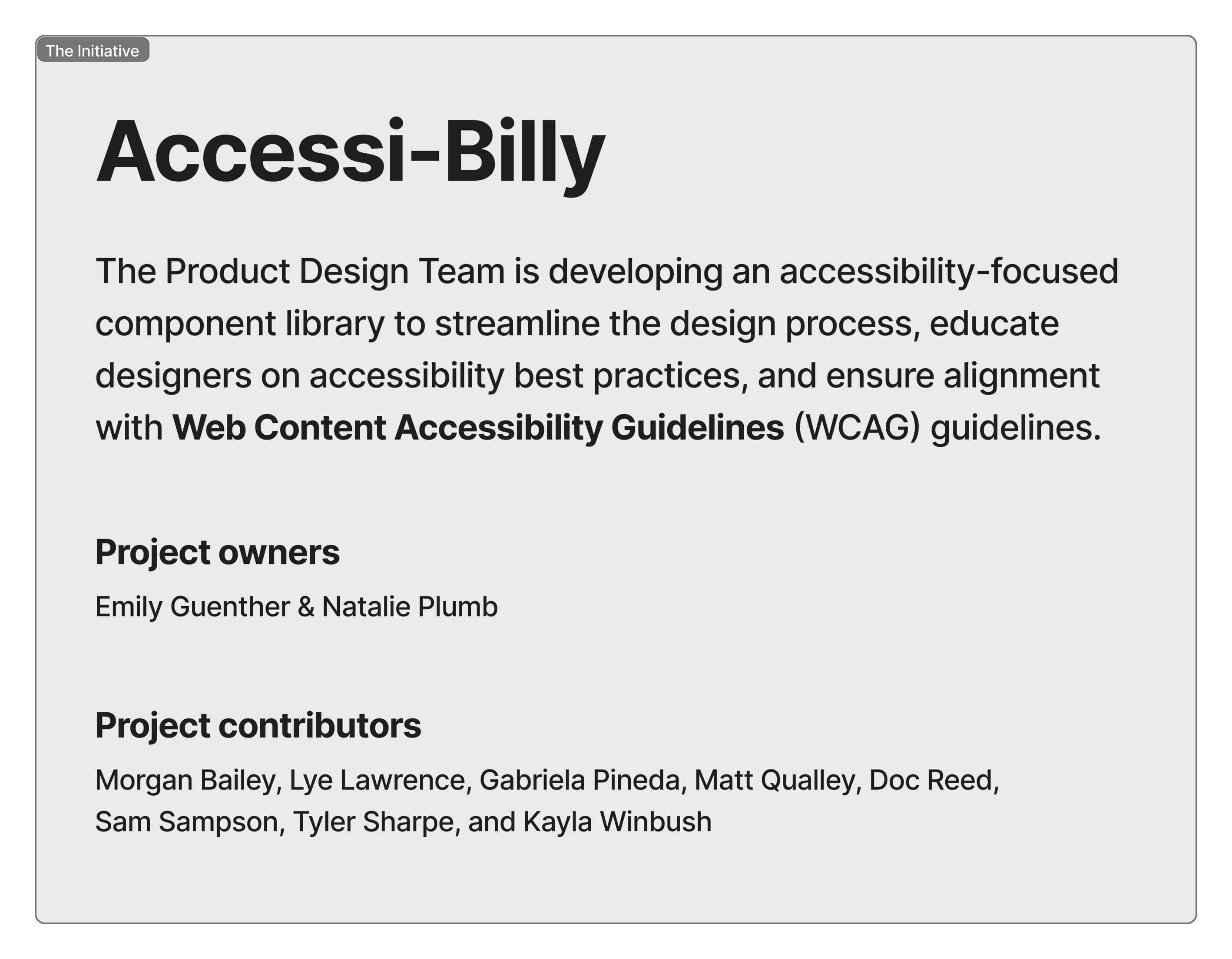
On Friday January 10, a project fueled by a small group of folks working at Method will be released. It’s been on the radar of my coworker Emily Guenther for close to 2 years. Some life circumstances pushed pause on things but the last half of 2024 saw a push to bring this toolkit to the product design community. It can be found in Figma's Community.
Emily Guenther and Natalie Plumb partnered to research WCAG guidelines and A11Y compliance documentation. From there they did their best to distill the findings down to a less complicated resource. After sharing the project with the internal design team at Method the team grew. Ideation and availability shifted as client projects and life happened for us all so many hands touched and made this possible.
I joined the team to tackle the brand elements and strategy. It was a blast.
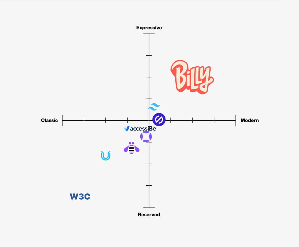
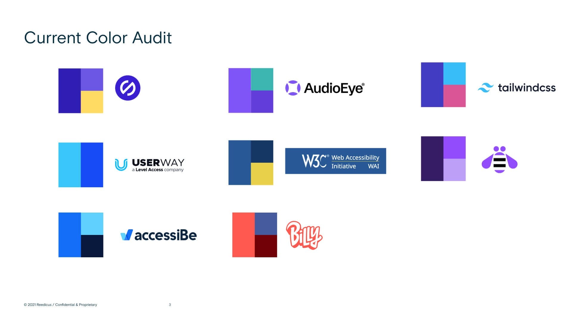
Part of what I do for my clients is some market evaluation and strategy. We did an audit of competitors and resources, reviewed color palettes, personality, and position in the market. This all was to help Emily and Natalie ask and answer questions about what they wanted this to be once it was released.
“The target audience wants a tool that doesn't just point out accessibility issues, but educates, guides, and transforms design thinking toward truly inclusive experiences.”
Leading them through a strategy session to get them talking about all kinds of aspects of the initiative to help us all get on the same page. Here is a peek behind the curtain on some of what we looked at as we built Billy.
We talked about how we wanted Billy to show up in the market. I remember hearing from both Emily and Natalie that,
“Accessibility guidelines and ADA compliance rules are dense and not the easiest thing to understand. This needs to be fun so people will learn and teach others.”
Type plays a huge part in the vibe of brands. That was a point of contention with this project. Why? Well, most things in the accessibility space don’t have much brand personality or deviate from clean type and visuals to make them as accessible as possible. Clean sans serif fonts are used for legibility. Colors are picked to ensure color contrast ratios that meet AA and AAA standards.
Could we get away with zigging when everyone was zagging?
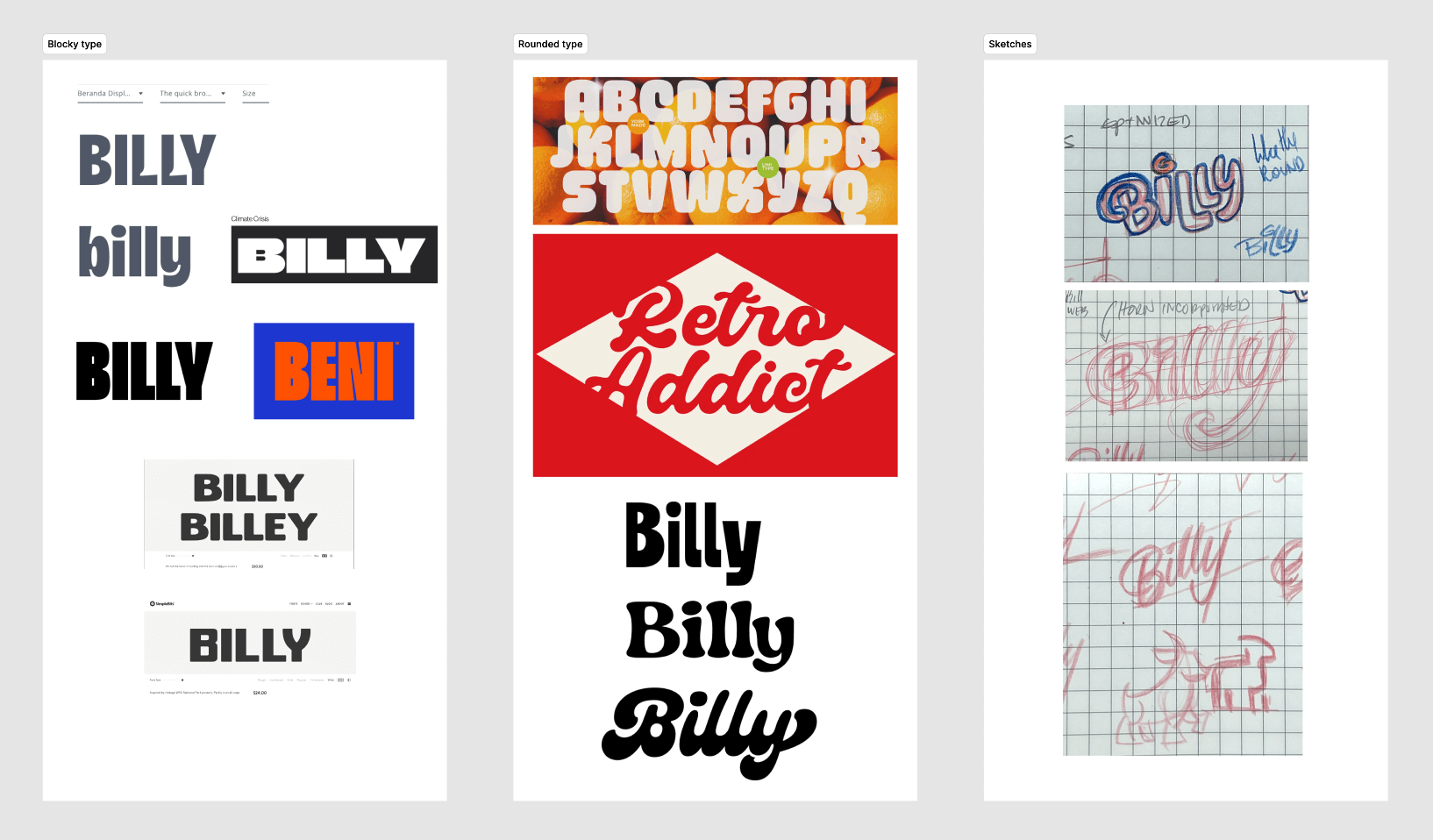
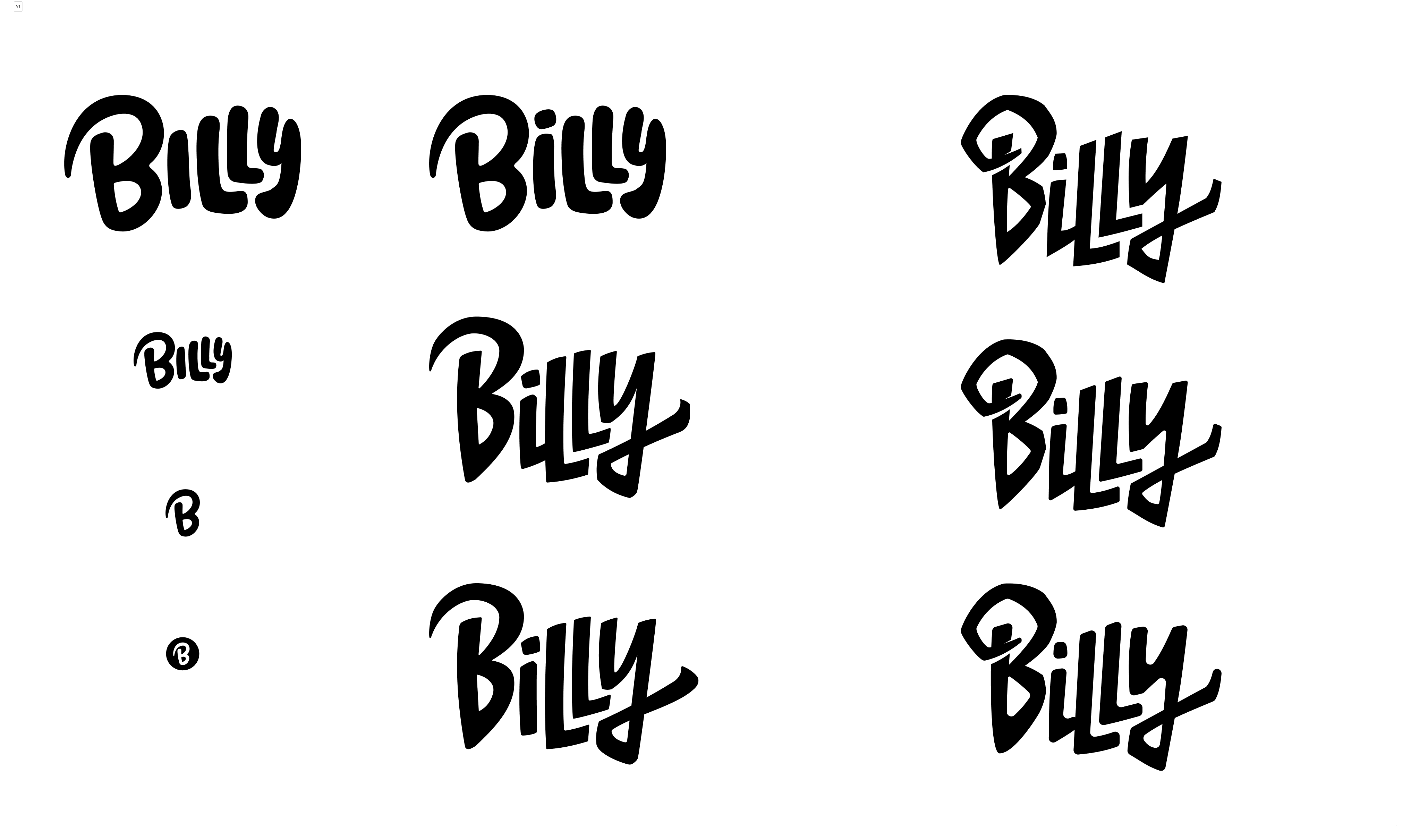
We all loved the first version, but I realized all the time spent with my kids watching Bluey (i.e. kids watched, I cried) had unintentionally found its way to the initial mark.
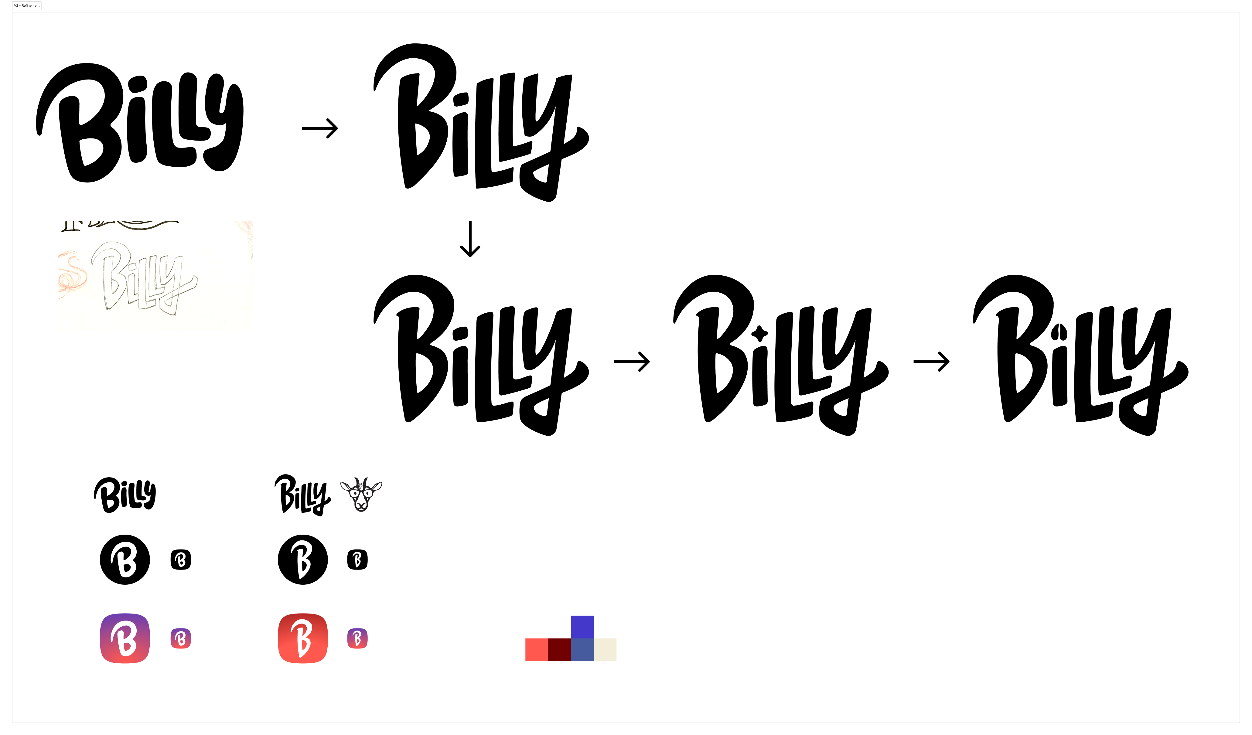
So we pivoted. I wanted the playfulness to remain. I also wanted to do some swashy-swashness with the tail of the y.
We all liked how the letters pushed into the space of their neighbors but also made room for them to breathe and maintain their playfulness. I did get ambitiously playful with how to dot the “i,” but pulled back. Not proud of the rabbit trail, but going off course often helps us get back on track.
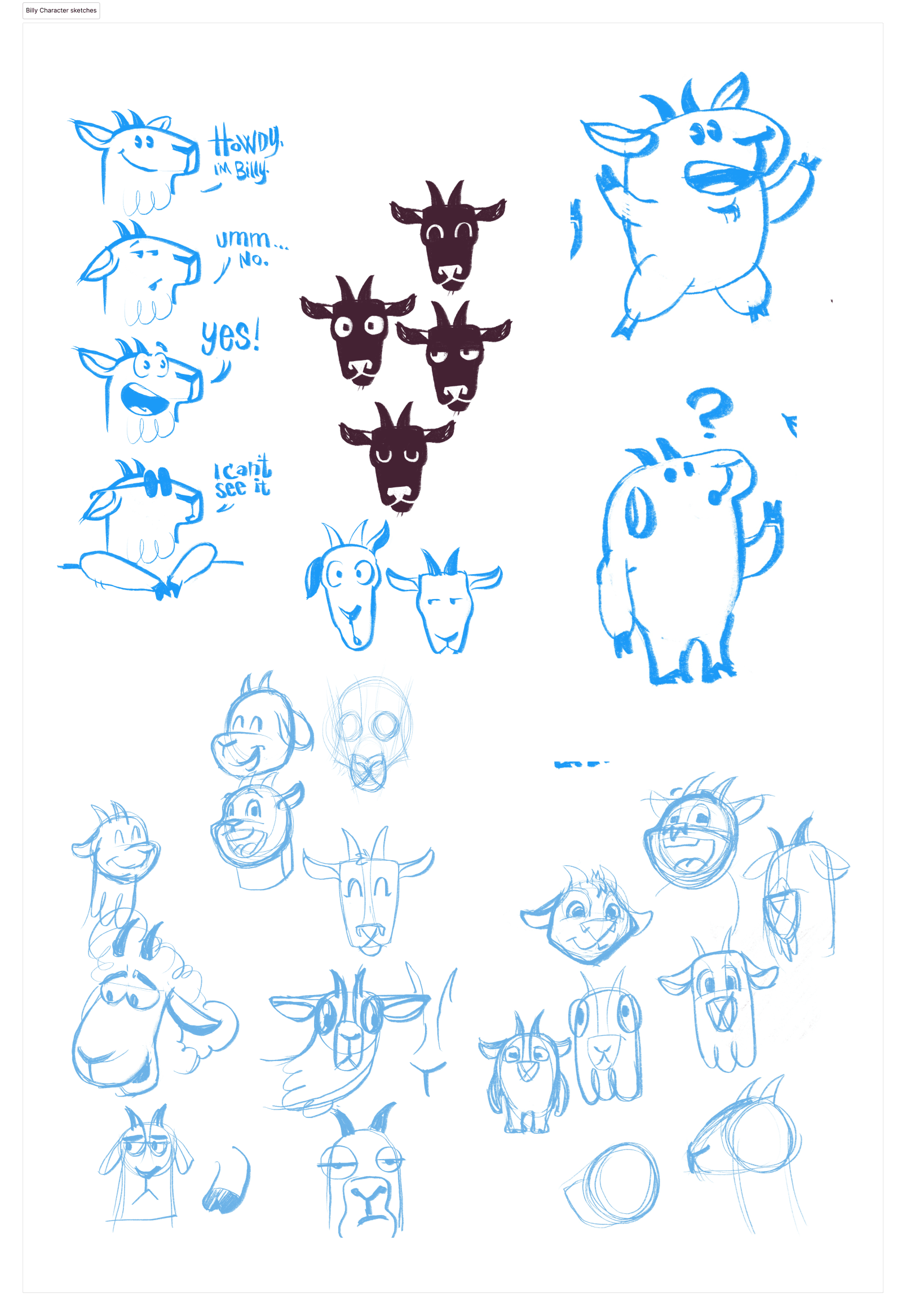
Next up was to tackle the mascot. We knew it was gonna be a goat. Why? Cause designers are punny—time for a little time travel.
In an early conversation about building this, it was jokingly said
“We should call this AccessBilly.”
Smiles and excitement sprinted through the zoom call.
”..and we can have a goat be the mascot.”
Shortly after, it was suggested I be brought in to handle this aspect. I was hooked and jumped into researching goats. So many analogies could be drawn and back up this decision. These are a few of the findings I shared during a department wide Team Meeting a few weeks later.
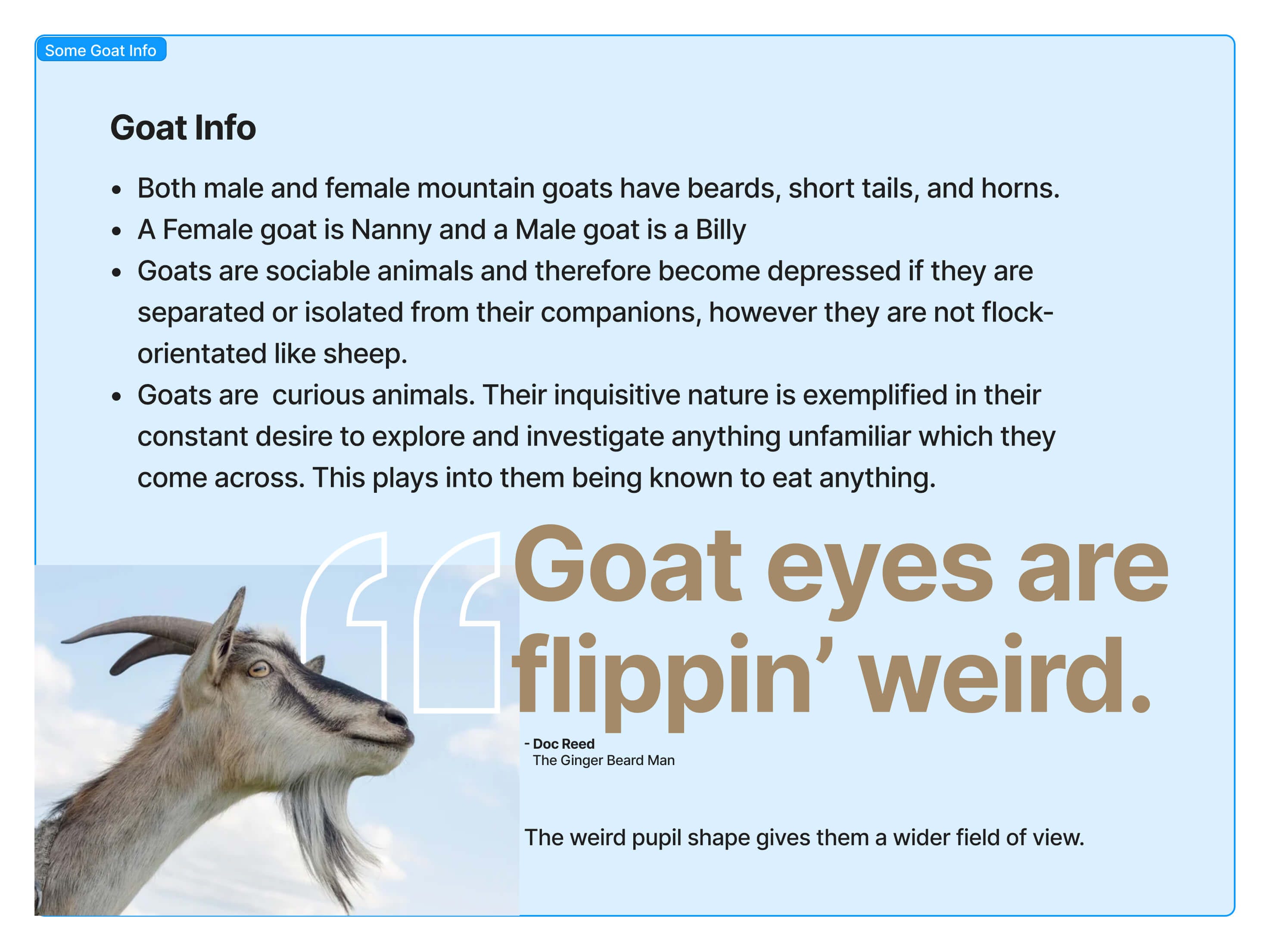
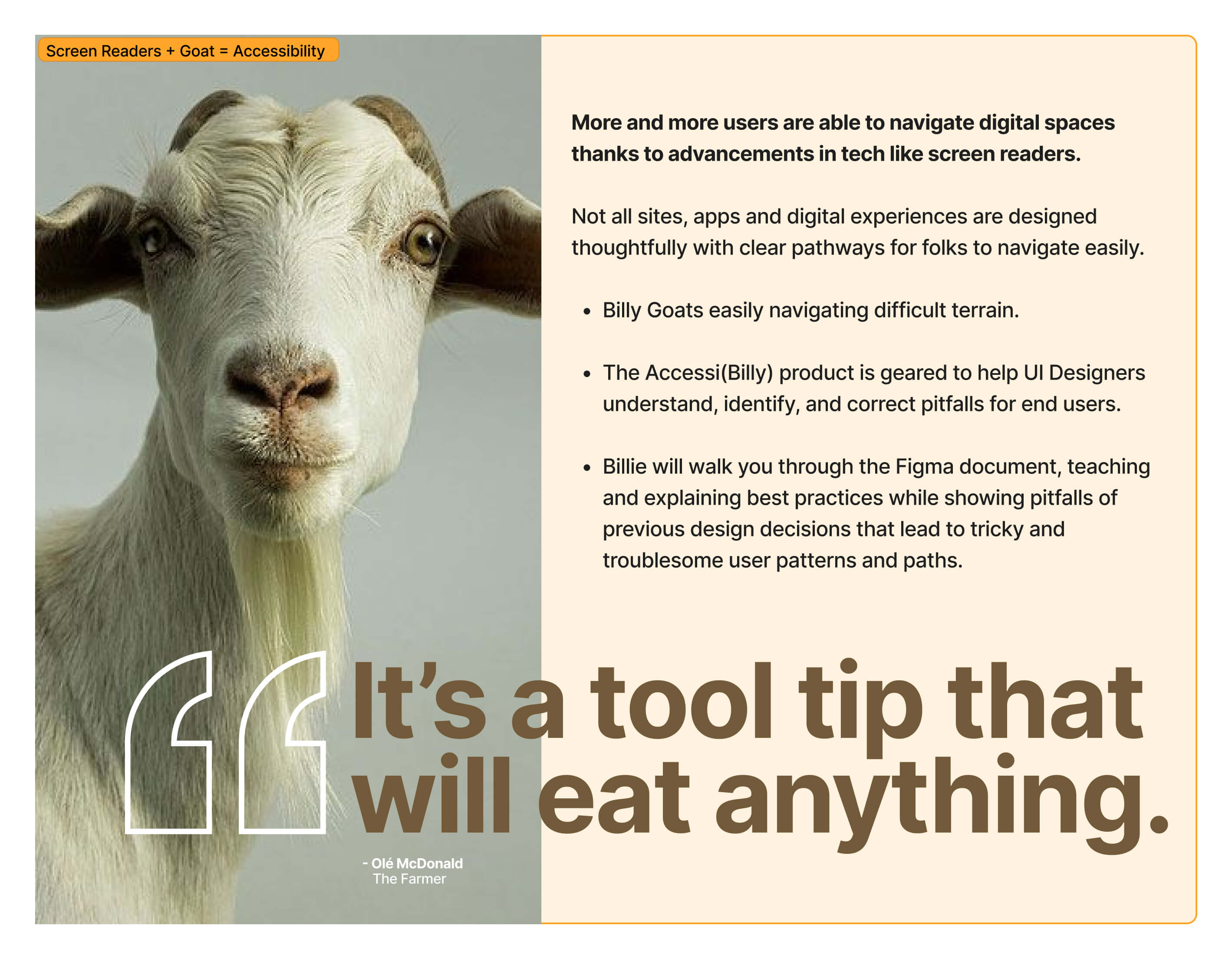
So yeah, it had to be a goat.
The project is live. Go check it out.
I’ll put together a bit more of a final presentation in the future but wanted to give a little background and context about this project.
If you are at all in the product design space or curious about best practices for UI design, I encourage you to take a peek at this file.
Plus you get to see how this all came together.
If you know a product designer seeking accessible components or passionate about inclusive design guidelines, please share Billy with them.
Here are a few selling points:
• Resources for managers and professionals responsible for ADA compliance
• Complete UI toolkit with WCAG-compliant components
• In-depth accessibility documentation
• Practical design knowledge and best practices
If you have any ADA stories, run-ins, or wishlist items about UI accessibility drop them in the comments. It'll be exciting to start a list of items for the change log.